Textile work has a habit of looking better in the room than on the screen. A woven panel that shifts from grey to green as you walk past it becomes a flat rectangle in a photograph; a dense tapestry the size of a doorway can end up looking like a coaster. The cloth isn't the problem. The camera is doing what it always does: collapsing depth, flattening sheen, and losing every cue that told you how big the thing was.
The fix isn't expensive equipment. It's a handful of decisions made in the right order: read the material, choose the light for the quality you want to show, style the frame so nothing competes, and give the viewer an honest way to measure what they're looking at.
Read the material before you set up the camera
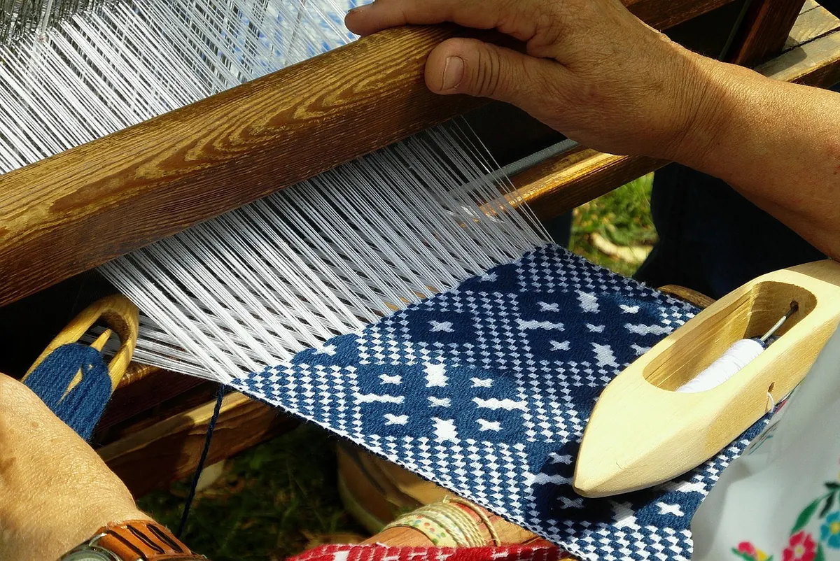
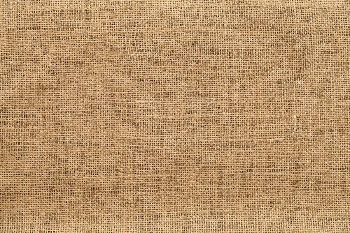
Every textile asks for something slightly different. A thick wool tapestry with loops and slubs will show its structure under a hard light from the side; a silk habotai will turn that same light into a blown-out streak and lose its colour entirely. Velvet swallows light and needs a grazing source plus a little fill so the pile doesn't read as a black hole. Felt is subtler than it looks and often photographs as a flat coloured shape unless the light comes in almost parallel to the surface.
So start by naming the one quality the photograph has to carry: surface, construction, colour, or size. You will not get all four in one frame. Decide which matters most for this piece, light and crop for that, then make separate frames for the others. A portfolio needs three or four pictures of a strong work anyway — one image is a thumbnail, not a record.
Two kinds of light, two different jobs
Most textile photographs disappoint for the same reason: the light is doing nothing. It sits on the camera, hits the work straight on, and returns a perfectly even, perfectly boring rectangle.
Raking light for texture
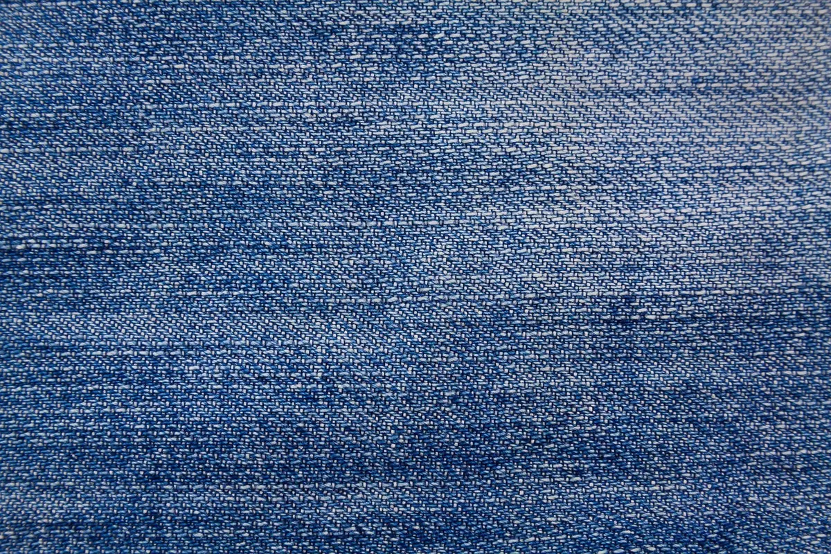
Put the light low and to one side so it travels across the surface at a shallow angle, somewhere between ten and thirty degrees. Every raised thread throws a small shadow and the weave appears. A window in the early morning or late afternoon gives you this for free if you set up close and nearly parallel to the glass. Indoors, a single lamp with a small shade works, or an off-camera flash with a grid to keep the beam tight.
Move the light slowly while watching the screen. There is a point where the texture pops, and a few degrees further where the shadows collapse into noise. Keep the source out of the lens, and hold a piece of black card just outside the frame to stop stray light flaring across the surface. Camera on a tripod, low ISO, and let the shutter stay open for a second or two if it needs to.
Broad, even light for colour
For an accurate colour record, do the opposite: a large, soft source at roughly 45 degrees to the surface, with a white board opposite to bounce light back into the shadows. An overcast day and a north-facing window are the cheapest version of this. Add diffusion — a stretched sheet of translucent fabric or a proper panel — to make the source bigger, and kill any spill from coloured walls, wooden floors, or the sweater you're wearing.
Put a grey card in the first frame of every setup and set white balance from it. Indigo, madder and other saturated dyes are exactly where a warm colour cast hides, and a buyer will notice it before they notice the stitching.
- A window with indirect daylight
- A diffusion panel, or a thin white sheet stretched flat
- Two pieces of white foam board for fill
- Black cloth or card for flags and backgrounds
- A tripod, plus a remote or the self-timer
- A grey card
Style the frame so the work is the subject
Backgrounds and props
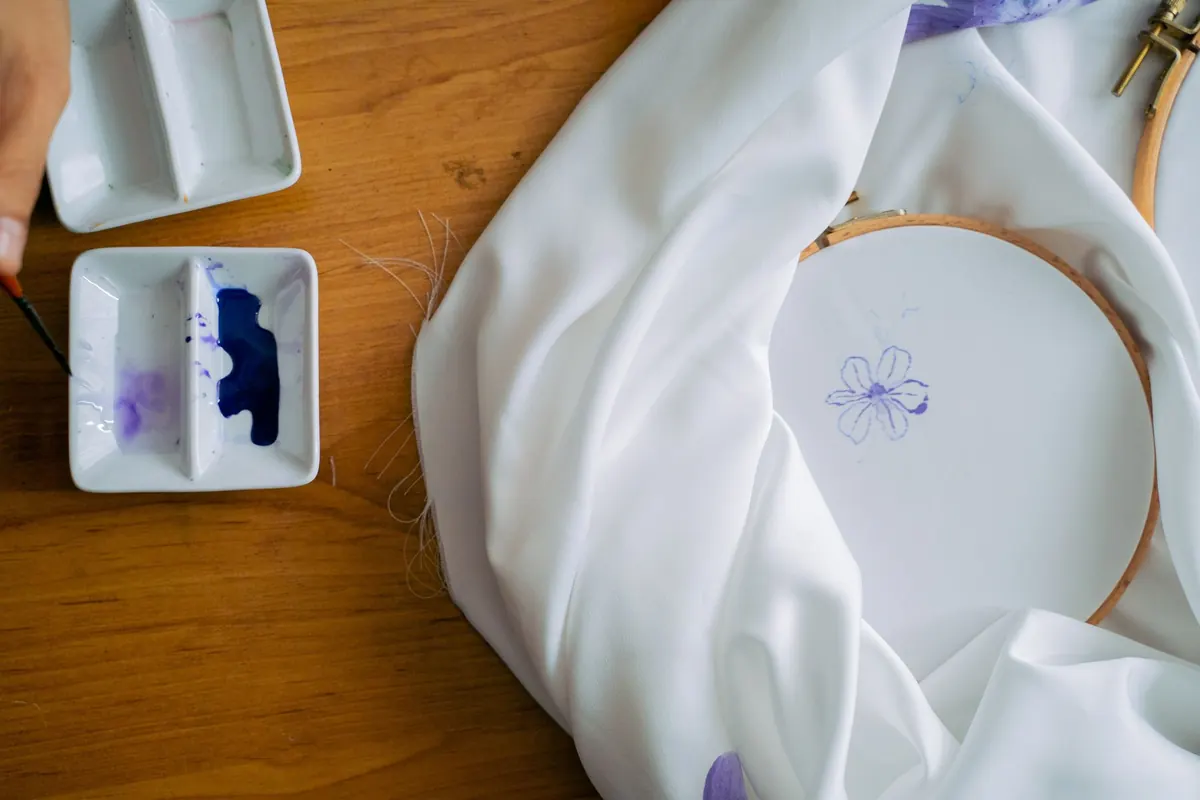
Use a mid-grey or a warm off-white with a matte finish: paper, painted MDF, a length of heavy cotton. Pure white looks cheap and blows out easily, a bedsheet shows every crease, and a wooden table adds a colour cast you'll spend twenty minutes fighting. Grey flatters almost everything and lets dark cloth and pale cloth read correctly in the same session.
Props should answer a question or stay out of the shot. A chair leg, a hand, or a doorway tells the viewer how big the piece is. A dried flower arrangement tells them nothing and steals attention.
Hanging and flat lays
Wall pieces should be hung properly, under tension, squared to the camera. Put the lens level with the centre of the work, not above or below it, and check the verticals against the edge of the screen. Sagging cloth reads as sloppy making, even when it isn't.
For flat work, shoot straight down with the camera perfectly parallel to the surface. A small bubble level on the hot shoe saves a lot of correction later. Smooth the cloth without stretching it, and work from the centre outwards so the last wrinkles you touch are at the edges.
Make scale legible
A photograph has no size. Your job is to give the viewer one reliable cue and then not undermine it.
- Shoot the full work square-on, filling about eighty percent of the frame, with even margins so the crop doesn't distort its proportions.
- Make a second frame with something whose size is known — a chair, a door frame, a hand laid flat at the edge.
- Take one detail at the real size of the cloth, so a stitch or a slub reads as it does in life.
- Photograph the back or a join. Construction is part of the work.
- If it drapes, show it draping. Cloth hanging tells the truth about weight.
- Photograph it beside a piece from the same series, so relative size reads across the portfolio.
Then write the dimensions in the caption, in centimetres and inches, with materials and year. A viewer forced to guess will guess small.
Crop for the grid, keep detail for the click
Portfolio pages are mostly seen as thumbnails. Choose one aspect ratio — square or 4:5 — and use it consistently for the main image of every work, so the grid reads as a body of work rather than an accident. Leave a margin of background around the piece; a work cropped to the edges of the frame always looks smaller than one with air around it.
Edit less than you think
Set white balance first, then exposure, then look away before touching contrast. Textiles collect sharpening halos in the weave, so keep sharpening low and check the result at full size. Don't push saturation to make a dye look richer than it is; colour accuracy is what makes a portfolio trustworthy. Straighten, spot out dust, and export as sRGB at around 2000 pixels on the long edge.
A last check before it goes live
- Does the texture survive at thumbnail size? If not, make the detail shot the main image.
- Is the colour the same on your phone as on your laptop? Check both.
- Can you tell roughly how big the work is without reading the caption?
- Is anything in the frame that isn't the work, the wall, or the reference object?
- Is the file named for the piece rather than IMG_4471?
Then publish, and put the raking-light detail first. Texture is what persuades someone to click, and it is the one thing a camera will never catch by accident.
Photo: lovepixs / Pixabay